Project Dynamics
addtimes:2026-07-30 click:383 author:Gimsun
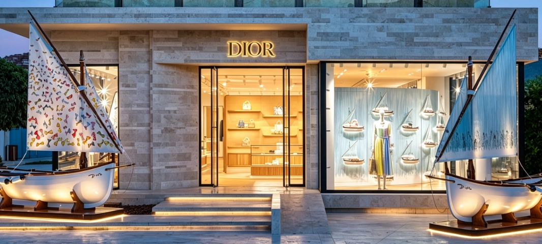
Summer 2026. Dior rolls out its Dioriviera collection across nearly 20 destinations — Paris, Seoul, Sanya, Saint-Tropez, Phuket. Pop-ups. Windows. A complete lifestyle takeover. As detailed on Dior's official website, this season's Dioriviera transforms urban retail into a global resort experience.
Blue-and-white striped sails rise alongside rattan fixtures and natural-toned settings. A single, unified language. The consumer doesn't just look at a window — they step into a Mediterranean summer. This isn't a seasonal refresh. It's world-building. From ready-to-wear and accessories to home objects, everything is wrapped in the same visual code. Large-format cotton prints cover window backdrops, awnings, cushions, furniture, and display props. Lightness. Elegance. A natural way of living. The brand says it, and the material proves it.
Look across luxury window design in recent years. You'll notice a shift. Natural cotton. Linen. Wood. Rattan. Paper art. Brands are pulling away from industrial materials and reaching for textures that feel real. Textures that carry warmth. This isn't just aesthetic preference — it tracks with a broader industry movement. LVMH's LIFE 360 environmental program has been pushing luxury toward sustainability at every touchpoint:
from raw sourcing to the retail floor. The material you choose now says as much about your values as your taste.
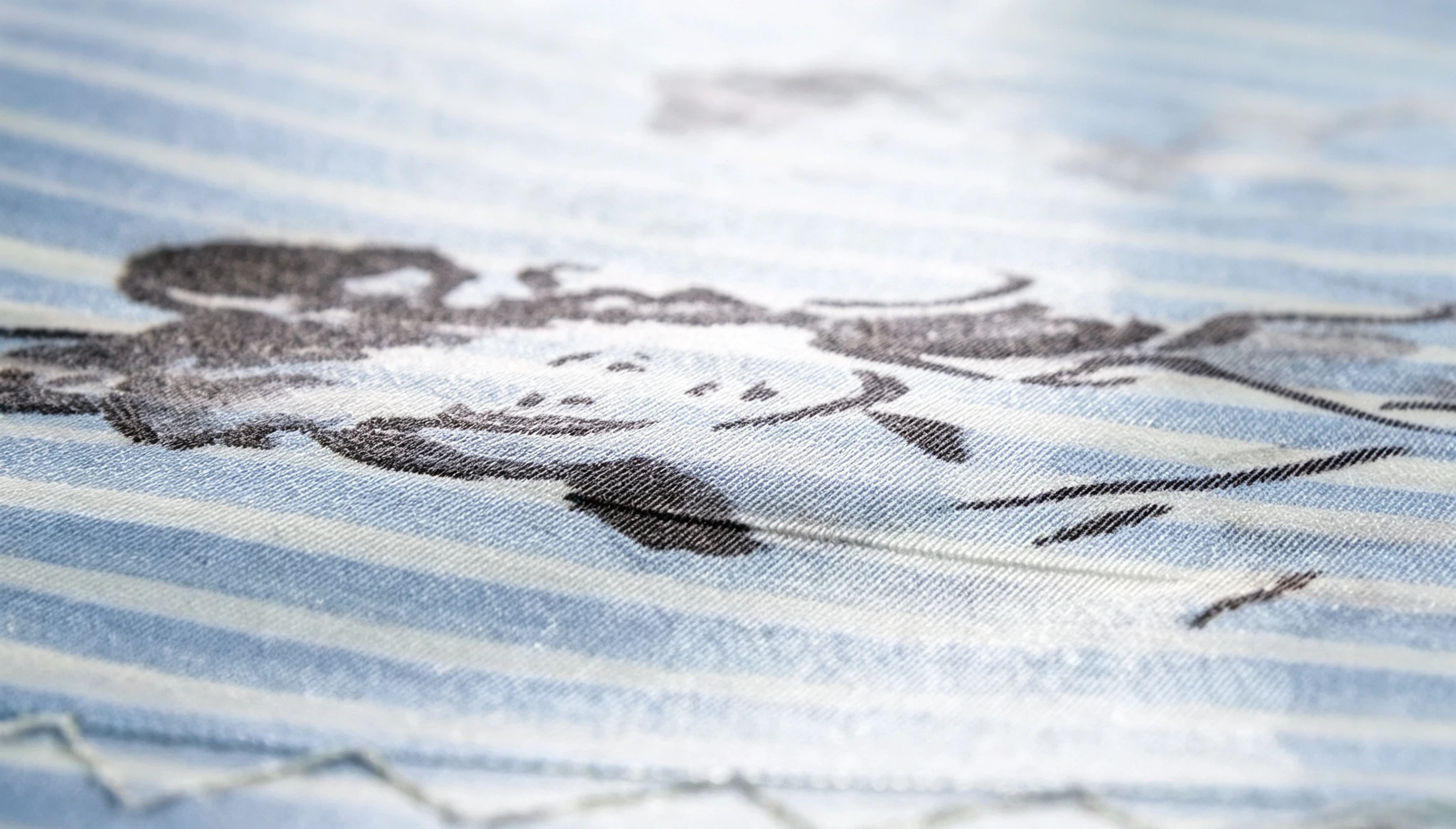
Now let's talk about cotton. Going from an art sketch to a physical display isn't straightforward — and cotton does something no synthetic can match. Its natural fibers produce a soft, diffused reflection. No harsh glare. PVC prints and polyester fabrics bounce light back at you. Cotton drinks the ink in. The result? Color gradients stay true. Watercolor washes retain their delicacy. Fine shadows don't get crushed. Designers see their work rendered with the nuance they intended. It's the kind of viewing experience a luxury retail space demands.
Grand View Research's digital textile printing market analysis backs this up: the global market is growing steadily, with natural-fiber fabric printing seeing particularly strong demand acceleration.
This project didn't come together by accident. It's the product of visual merchandising teams and suppliers locking in on three fronts: color management, material compatibility, and process standards. We've spent years refining our craft on cotton and specialty substrates — from color-matching samples all the way through to production runs. Here's what holds it all together.
Cotton is a natural fiber. It drinks ink differently from batch to batch. The same Pantone code that looks perfect on PVC can turn dull, gray, or flat on untreated cotton. The difference isn't subtle — it can break the entire visual.
That's why serious print suppliers build dedicated ICC color management profiles for each material type. Combine that with fabric pre-treatment, iterative proofing, and on-site lighting simulation, and you can dial in every parameter. Gradients breathe. Watercolor effects bloom. Fine texture holds. The design file lands in the physical world exactly as it was meant to.
Luxury window backdrops routinely span several meters wide. Some stretch past ten. A single printer can only go so wide, which means panels must be joined. Multiple panels. Zero tolerance for error.
For Dioriviera's stripes and continuous repeating patterns, even a millimeter of misalignment could shatter the visual rhythm. This demands more than just precise machinery. It requires a standardized workflow across layout planning, splice positioning, and edge calibration. Get it right, and the seam disappears. The consumer never knows it was there. That's the point.
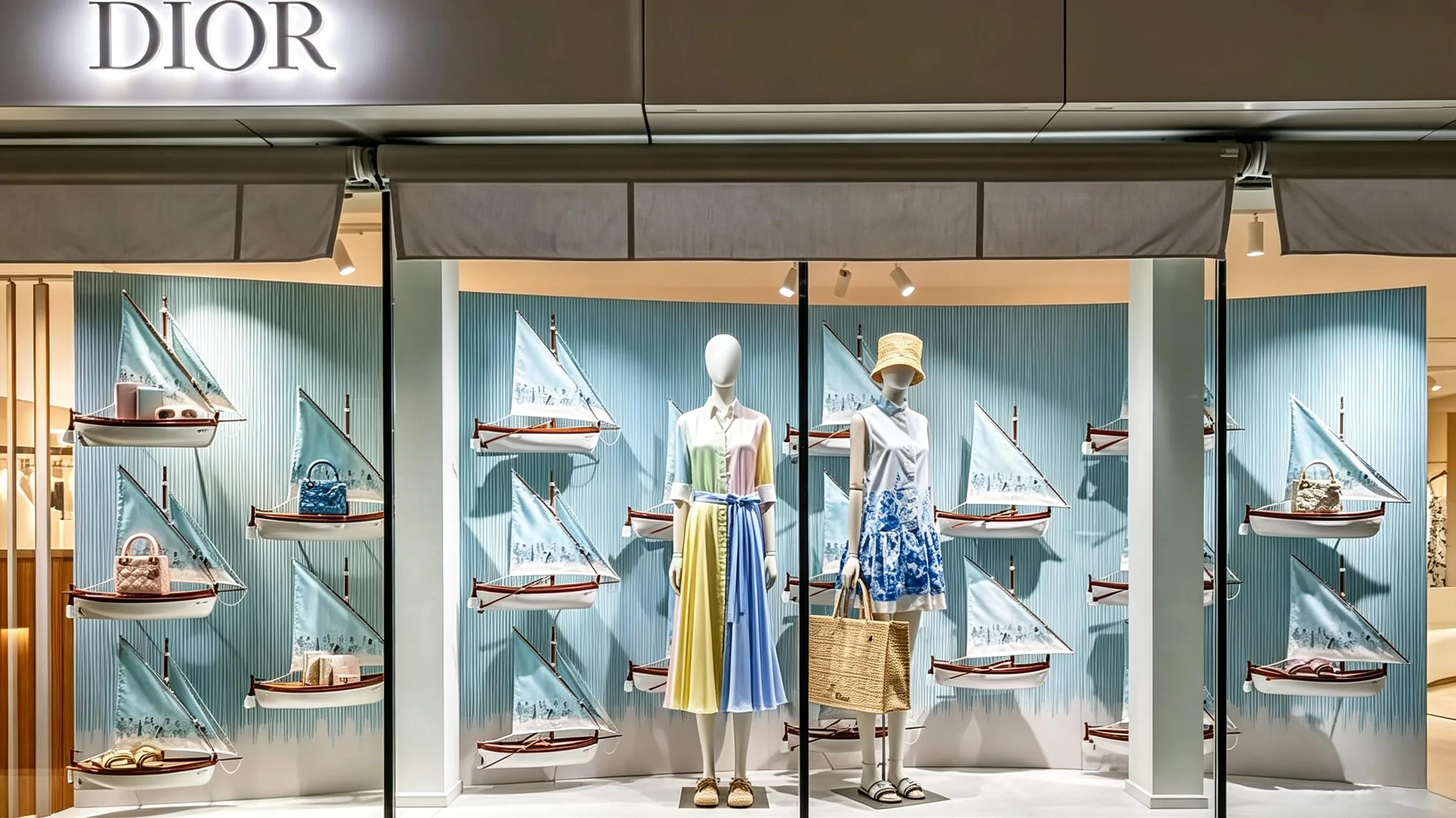
Printing is step one. Cotton still needs cutting, sewing, edging — sometimes multiple finishing stages. If you haven't accounted for every downstream process from the start, you're gambling. Ink can crack. Colors can shift. Fabric can shrink or warp. Any one of these can quietly ruin a display before it reaches the store.
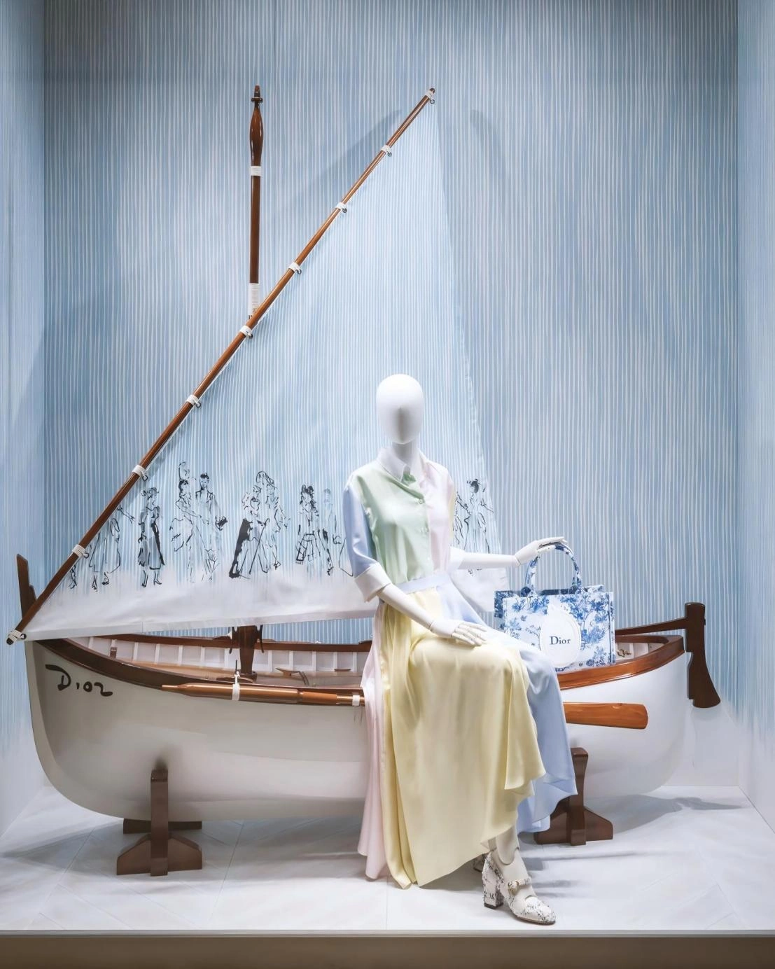
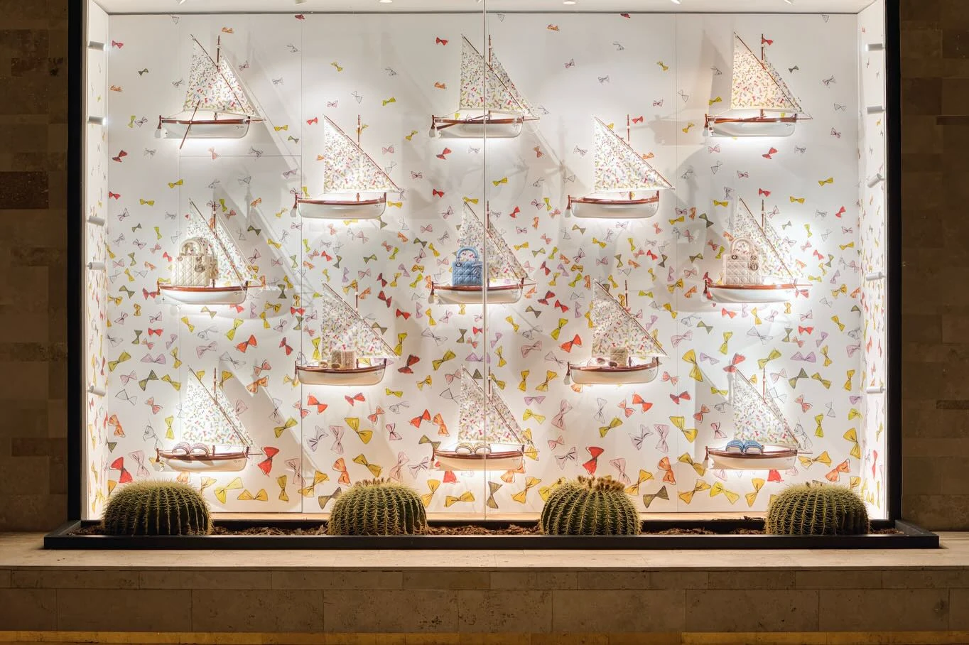
Blue-and-white stripes carry unmistakable coastal symbolism. Sailboats. Shorelines. Sunlight on water. Summer escapes. The bow motif brings something different — lightness, elegance, a touch of ceremony. Paint them by hand instead of printing mechanically, and the commercial edge softens. The window becomes less like a retail display and more like a walk-in artwork.
In conventional window design, the backdrop does one job: it supports the product. That's it. In this case? The backdrop is the narrative. Stripes and hand-painted bows don't stop at the fabric panels — they flow onto garments, bags, soft furnishings, and display props. A unified visual identity system. Coherent. Intentional. Unmistakable.
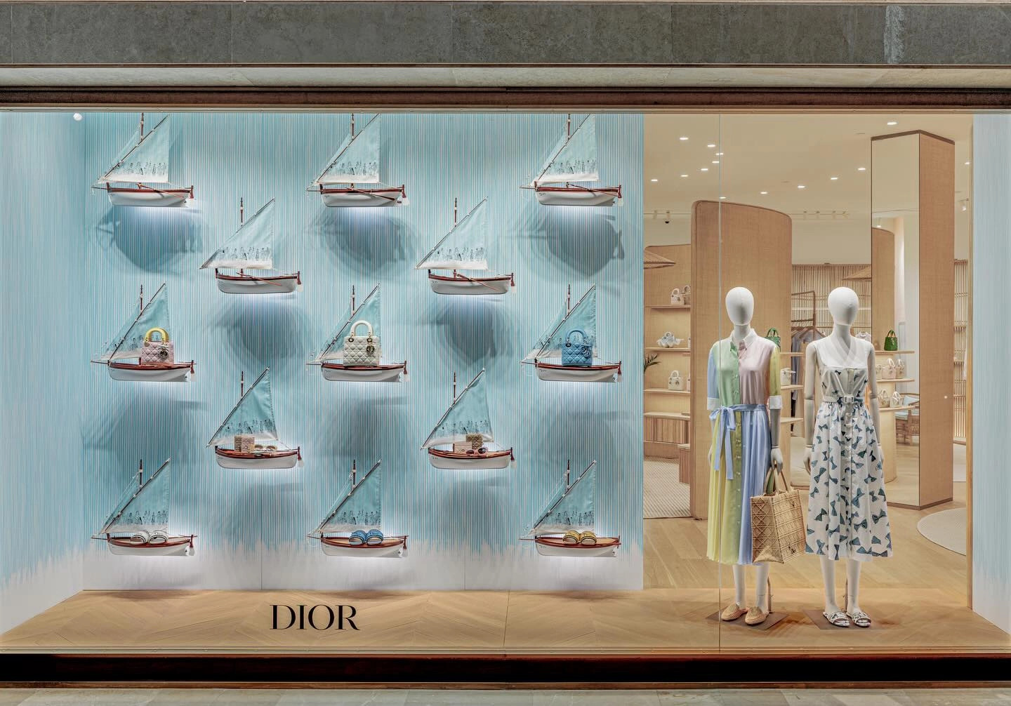
When a single pattern language runs through the backdrop, furniture, textiles, packaging, and product, the entire space settles into a natural visual rhythm. The consumer doesn't walk in and see a handbag. They walk in and enter a resort world the brand has built. The product belongs to that world. It feels inevitable. This shift — from product display to experience design — is one of the most consequential moves in luxury retail visual today.
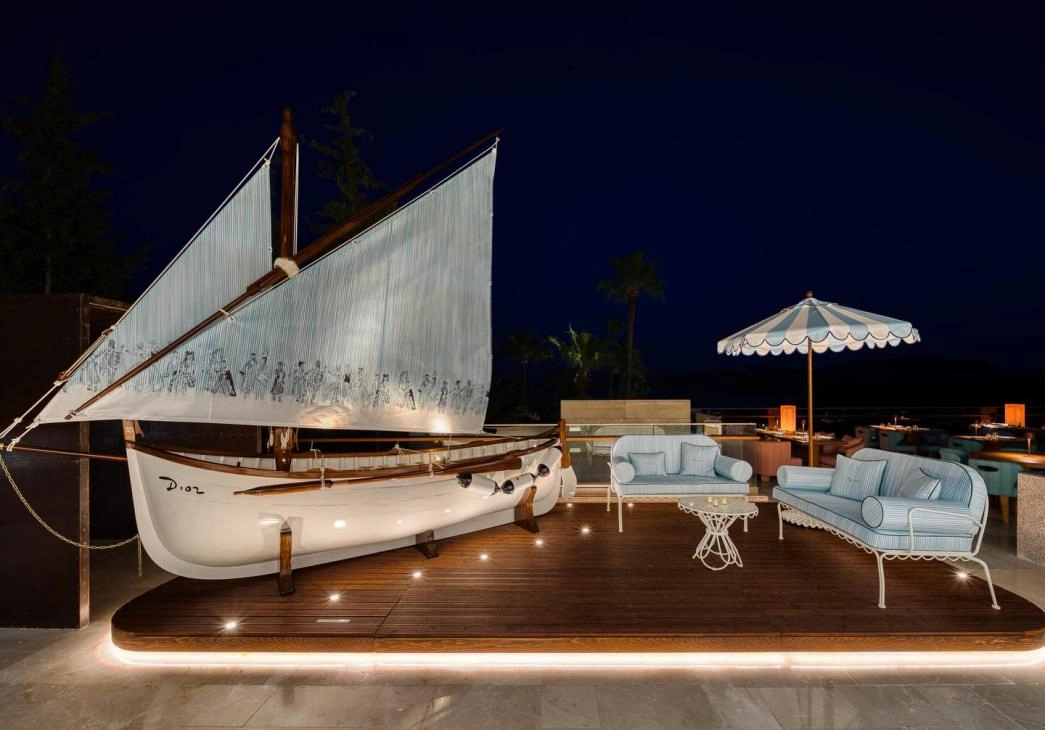
The future of luxury window competition won't be about who builds the biggest prop. It'll be about who can weave materials, patterns, colors, and products into a lifestyle the consumer can feel, live inside, and remember.
When the backdrop stops being a backdrop. When materials become part of the brand's story. That's when GIMSUN moves from "executor" to "co-creator of brand visual experience." True creative execution isn't just about matching the design. It's about making the brand's worldview visible. Tangible. Fully experienced — in every process, every material, every delivery.